THE TORCH AND HAMMER:
Logo and packaging design for Metalsmith and Jeweler, Rose Nolan.
THE SITUATION
Professional jeweler and metalsmith Rose has been creating beatiful and bespoke pieces of jewelry for years – both at her full-time job at a family-run jewelry store in Clayton, Mo., and as a side hustle out of the workshop in her very own basement. A true craftswoman and student of her trade, she wanted a hand-crafted, vintage logo and brand to match her handiwork.
THE SOLUTION
We created Rose a wordmark and logo as meticulously detailed and crafted as the pieces that come off her bench – without being too stuffy about it. It was important to Rose that the brand reflect the fine, hand-made nature of her jewelry, but still be approachable. The vintage-styling of the wordmark and handlettering showcase the brand’s high quality without coming across as too posh or delicate. After all, it’s just “rocks and metal” as Rose likes to say. Several variations of the logo and wordmark were created to provide the brand a versatile system that would work across all touch points of her brand experience, including the packaging and jewelry boxes.
What we did:
Logo Design
Packaging Design
HandLettering
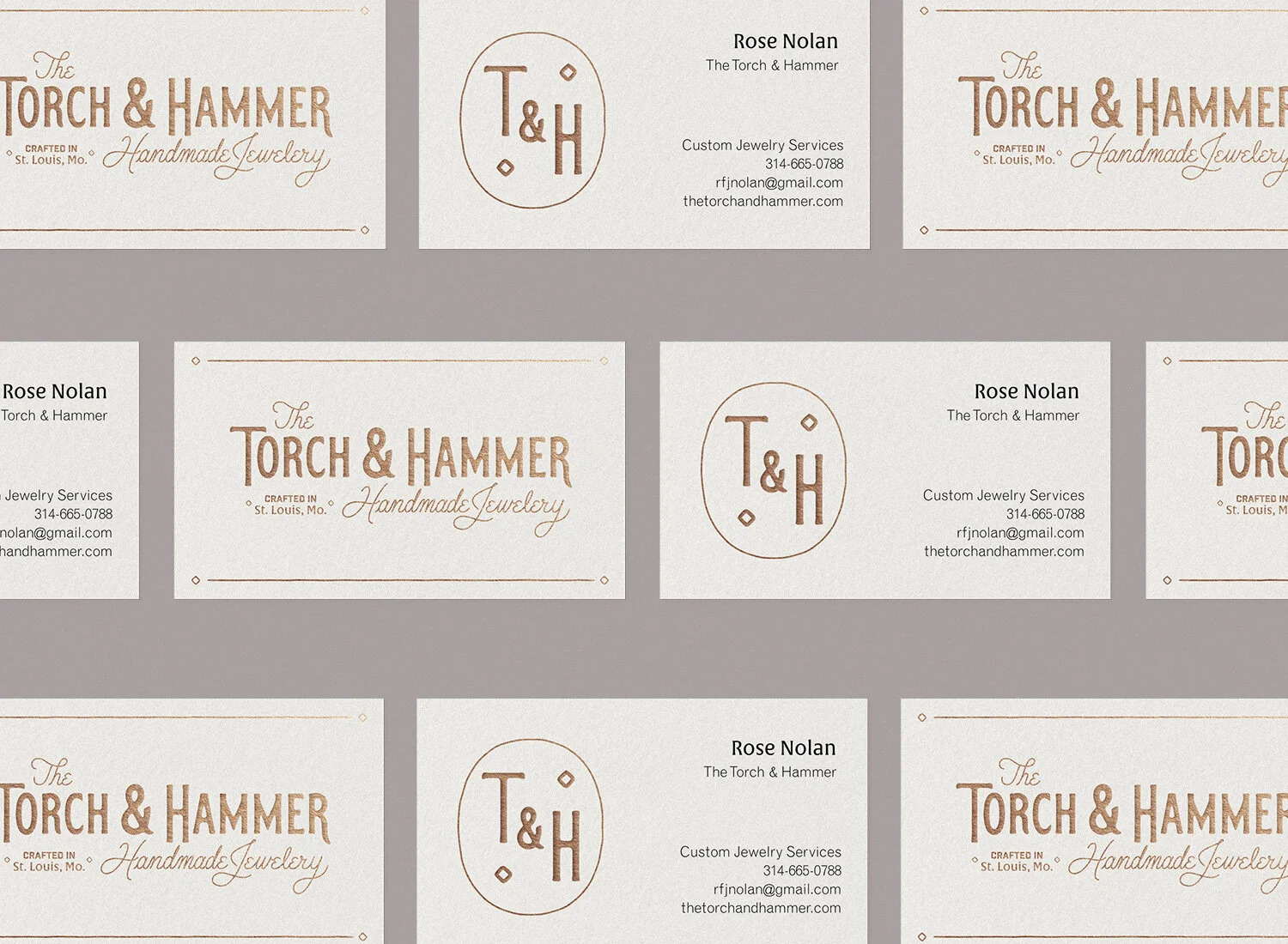
Business Card Design
Brand Typography
OUR FAVORITE PART
The hand-drawn mark! We were so inspired by Rose’s hand-crafted items that we knew we had to reflect that in her mark in some way. Bobby got to sketch and explore a lot of different lettering styles before we found the perfect balance of refined quality and charming approachability.
brand colors
The palette was intentionally limted to natural colors and finishes along with the striking burgundy, which shows up in the packaging. This muted palette allows the striking pieces of jewelry to shine.


